-->

26 May 2017

Fragrance Project | Task 4


*insert huge sigh of relief* 

This booklet pretty much marks the end of Year 1 FCP. I won't go into the whole "it's gone so quickly" thing because that's another post, but IT'S GONE SO QUICKLY!

Anyway, for the last quarter of our Fragrance Project, we had to individually create a booklet, explaining our twelve month promotional plan for our perfume brands.

The booklet starts with a brief overview of what we've been doing 'up till now'. So that's our research (context), the big idea, creative concept, etc, which I go into more detail in this post. The next section is 'who we are'. This covers the behaviour of our target consumer (a 22-30 year old woman), the brand model for Mist & Matter, and a mock-up of what our packaging would look like. I touch on this area a little bit in the last post that I wrote for this project, and it also brings us in to the next section, 'communication'.


The promotional/communication was the hardest bit of this task. I think because we'd already covered the first half, I'd got that done quite quickly, but this was the first time that I'd actually sat down and thought about how we could promote the brand and it proved harder than I originally thought.


I started with a moodboard of our visual inspiration and a copy of our print ads, which I touched on in the Task 3 post. I also created two mood boards for what our summer and winter editions would look like, and I think these are my 4 favourite pages in the whole booklet. I took inspiration from issue 18 of Flow magazine.


Then I went on to the communications tools. I wanted to reflect the nature of the product, whereby the consumer would use it from the beginning to the end of the day, so I came up with an integrated communication strategy, which would almost follow the customer through their day-to-day life. I've used both traditional techniques, such as bus stops and billboards, as well as digital techniques, like social media, collaborations with Spotify and bloggers, and I also created an app, which would alert the consumer throughout the day.


This then took me to my last section, 'long story short'. In this section I summarised my promotional plan with a 12 month time line, and then with an overall summary, which basically says how our integrated campaign will allow Mist & Matter to reach it's full potential and to be successful. We would also hope that we could expand the brand in to the future by adding ranges for teenagers and men.


As much stress as creating this booklet caused me, and as much as I complained about it, I'm actually kind of bored now because for the last week this was all I was doing. Morning till night. I'm definitely getting more confident on InDesign now too, which is a plus. I just hope the hard work is worth it, because there's nothing I can do now!

Georgia.xo 

21 May 2017

KKW X Kylie Cosmetics Review

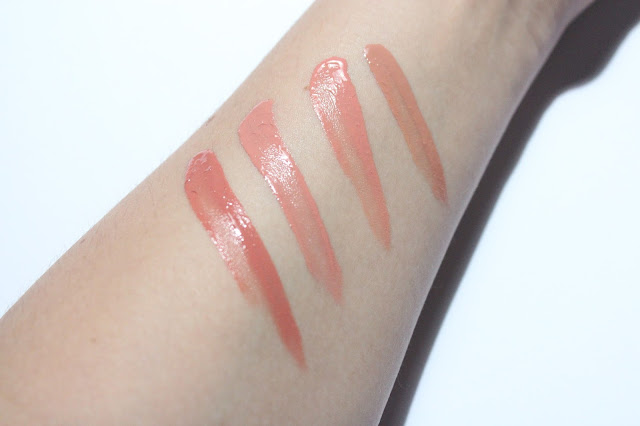
From top to bottom: Kimberly, Kim, Kiki, Kimmie. 
About a month ago now, Kylie Jenner revealed her collaboration with Kim Kardashian, 'KKW by Kylie Cosmetics'. When they were first revealed I wasn't really that bothered about it; I'd become less interested in the brand, and the novelty had worn off. But after seeing image after image of the swatches and the packaging, I kind of started to fall in love with the collab. That's the power of social media promotion I suppose.

I actually read an article that was linked to Business of Fashion where the interviewer asked Kylie how social media has played in to her marketing strategy and she replied by saying that she's never paid for advertising, it all comes down to Instagram, Snapchat and Twitter.

Anyway, the launch date arrived. It was a few days before my birthday and I suddenly found myself on the website, then in the queue, and then at the checkout. I wasn't expecting to get hold of them, but I don't think they sold out as quickly as other launches that she's done.

The packaging is beautiful. It's quite minimal, but the material is a lot stronger than the boxes you get with the standard lip kits and having the sleeve gives it more of a precious feeling.

I haven't managed to try out the actual lipsticks yet because my lips have been so cracked, but when I swatched them on my arm, the formula seemed really smooth, and when I spread it out a bit it dried really quickly but stayed looking consistent. In terms of the shades, I love them all because I am a nude girl, I don't really stray out of my comfort zone when it comes to make up. But there are two shades that I honestly can't tell the difference between and you can probably see that on the last photo (the two in the middle). I think 'Kiki' is meant to be a bit more pink than 'Kim', but hopefully the difference will show up better when I put them on my lips!

Although it did cost an arm and a leg, now I've actually got the set I don't regret buying them. Like most products, it does have it's flaws, such as the similarity in the shades 'Kim' and 'Kiki', however you can't fault the actual formula and you can tell that a lot of thought has gone in to the process of creating it.

Georgia.xo

17 May 2017

Embroidered


Embroidery is the craft of decorating a piece of fabric with needle and thread, and has been dated back to 30,000 BC. Cast ourselves to Spring 2017 and the craft is very much on trend.

From catwalks such as Alexander McQueen's Spring/Summer 17' Ready to Wear and Nguyen Cong Tri's No.10 collection, to high street stores and online sites such as River Island, Topshop and ASOS, delicately woven wild flowers are literally everywhere.

I'm really loving this trend at the moment. I actually recently brought a couple of items from an online store called missyempire.com (see the images below), because even though the weather is typically British right now, there's nothing that welcomes the spring season better than a burst of colour and handful of flowers.

Michelle White Embroidered Ruffle Bell Sleeve Top - £18.00
Iva Black Overlay Floral Embroidered Shift Dress - £24.00


I was also recently introduced to the artist James Merry, who takes vintage sweatshirts from sportswear brands such as Nike, Fila and Adidas and embroiders flowers and fruits and mushrooms, etc around the logos, which I think is super cool. He's also worked with the V&A Museum on an exhibition called 'The Embroidered Gaze' (see video here) and with Bjork on her virtual reality exhibition.


In other flower-related news, florist Herbes Fauves (@herbestfauves on Insta) has just finished setting up a flower pop-up shop in the & Other Stories Bordeaux store!

This is a trend that is definitely not wilting any time soon and I can't wait to hang my rain coat up and throw on my purchases!

If you're looking for any inspiration, have a look on my Pinterest bored dedicated to this beautiful trend → here ←


Georgia.xo

11 May 2017

Fragrance Project | Task 3


Today we presented our brand for the 3rd task of our Fragrance Project. 

Our brand is called Mist & Matter, and follows the tagline "feed your skin".

Mist & Matter is a skin care brand for young women (aged 18-25) who want to embrace, nourish and enjoy their skin. Bare skin is one of the most important things about our brand and we really wanted to focus on that. When doing market research we found that a lot of skincare products have quite clinical/medical packaging and a simple tone of voice, therefore we want to fill the gap that they've created. We want to promote skin care that does good, with a light hearted tone of voice.

Our product is a range of body mists (the mist) that you spray on top of a light moisturiser (the matter), which is enriched with anti-oxidants and SPF. The body mists are named after different females beginning with 'm', to link with the initials of the brand name and add a realistic touch to the brand. Layering fragrances proved to be popular when we spoke to consumers and sales assistants, because it adds a personal touch and also increases longevity.

This is our brand onion, which portrays the essence, values and personality of our brand. As you can see we're very playful and light-hearted, however we also see ourselves as considered because we're serious about doing good to the skin. The natural ingredients in our products have beneficial properties, which ensure the skin is being protected and cared for. 

This generation of consumer really cares about what goes on to their skin, and they are also concerned about ethical issues and the environment, which is why our brand offers a refill service to help with issues such as waste and recycling, and also encourage consumer loyalty to the brand. 


Part of Task 3 was to produce a print ad and also a video ad. For our print ad (as you can see above), we really wanted to focus on the bare skin and show the ingredients that are within the product directly on to the skin. We were inspired by the likes of Wolfgang Tillmans and an editorial by Henrik Bulow, for Dansk magazine, called 'Fore is More. Our model was the perfect fit for the brand due to her striking features, such as her orange hair and blue eyes. She felt really comfortable within the photoshoot and was natural and unposed. The pops of colour within our print ads really convey the fun and light hearted personality of the brand, as well as the font of our logo. 

Lastly is our video. We filmed on set and also included some found footage. When editing, we picked out the shots of the model laughing and enjoying herself, as well as clips such as berries falling and an extreme close up of skin, and set this against an up-beat piece of music (Mezzanine by Shields). We wanted to convey the fun side of the brand, as well as the key elements of the product. 


Georgia.xo

9 May 2017

An Ap'peeling' Edit


Over the last couple of weeks I've been noticing a lot more pops of colour around on the highstreet, and I'm particularly loving this orange hue.

Orange is a colour that I think suits just about everyone. It might seem a bit overwhelming in large doses, but by pairing it with a black crop top or a pair of black cigarette trousers, for example, it can really add that pop of colour that completely makes an outfit. Even if you're not too confident on going for a larger item, such as a skirt, you could just add a couple of accessories or a pair of shoes.

With the idea of summer starting to kick in, adding colour to an outfit is almost critical. I've seen a few bits and pieces that I want to add to my wardrobe from a variety of places, whilst shopping both online and in-store. In the above picture I've selected some of my favourites for under £35, so it's a trend you can definitely afford, even on a student budget!

Georgia.xo

2 May 2017

What I've Been Saving on Insta This Past Week...

Since starting the FCP course, I'm always screenshotting and saving things like crazy to give me inspiration on my projects, blog posts and for my sketch book, and since Instagram introduced the bookmarking tool, life has been made so much easier! I thought it would be a cool idea to show you what sort of things I've been saving on both my personal account (@itsgeorgiaxo) and my FCP account (@itsgeorgiafcp). 


@rimmellondonuk - sponsored 

This appeared as a sponsored post from Rimmel London and I saved it because it could come as great inspiration to a photo shoot where the make up, especially the eye make up, is important. It's such a quirky way to do eyeliner and I particularly like the turquoise colour, it really pops out against her fair skin and gingery eyebrows. 

@hungermagazine - 26/04/17

This is quite contrived and somewhat controversial, but I really like it! The caption to this was 'Mood 🌸👄🌸🍃', which I suppose kind of says it all; it's about attitude and exploring sexuality, but it's also what you make of it. I really recommend having a look at the Hunger Magazine feed because it's got an amazing aesthetic, which is full of colour and so culturally diverse. I'm going off on a bit of a tangent now, but long story short I think that it's images like this that we need to see more of to stop skirting around diversity. 


@alexandermcqueen - 24/04/17

Embroidery is everywhere at the moment and Alexander Mcqueen has been doing it really well in their SS17 collection. There's quite a few photos of their embroidered pieces on their Instagram that I've been loving. I love imagery of bunches of wild flowers, I've been seeing it everywhere from tattoos to post-production on photographers. Alexander McQueen could have gone completely overboard with this and taken on the look of an overgrown forest but they've got it to a level of perfection.


@urbanoutfitters - 30/04/17

This is very Mert & Marcus in terms of colour and that's what I love about this image. There's something I really like about coastal America/neon scenes such as this one. This particular image was taken by @gallivanti, who has a lot of images like this on his Instagram page. It reminds me of the scene in Spring Breakers (Harmony Korine) where they're in the pool at night when Candy and Brit are teasing Faith. Justin Bieber channelled this a bit too in the 'What Do You Mean' video. 


@flyingtigeruk

Lastly, I saved this one because I really want these ceramic pots and I really hope they get them in the UK Tiger stores, because this particular image was reposted from the Flying Tiger Belgium page. That's all really. I suppose I just wanted to show you how random my saves are and the fact that Instagram has now made it possible to categorised your bookmarked posts is perfect for making sure that your inspiration images are all together and not all muddled up with posts of random ceramic pots! 

Georgia.xo